
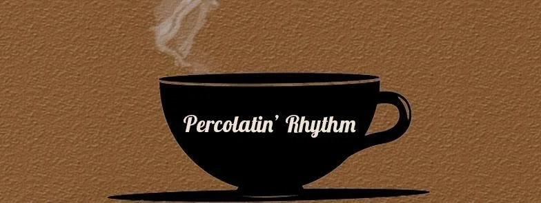
Kyle Smith’s feedback on this initial visual design shared on this blog post lives rent-free in my mind especially as a parent - “Kenny, this looks like baby poo brown.”
It’s been ten years since we hosted Percolatin’ Rhythm, a free live music event created to introduce ourselves to the Five Points Neighborhood. I was struggling with the image design and likely lacked a budget to hire someone. It can be a bit rough sometimes not knowing how to express your need for assistance.
Fortunately, that color text against a black background rated a 15.43 according to this Colour Contrast Checker though the choice of an italics font is questionable. Visual accessibility is important for our overall mission to increase accessibility and awareness of Lindy Hop and other Black social dances. Here are some important tools friends have recommended I use.
Free Adobe Photoshop equivalent which has an eyedropper tool. If you don’t know the hex color code, drop the file into Photopea and select the eyedropper tool to find out.
Color Checker Online Tools:
Knowing the colors you’re working with, you can use the following tools to assess which color combinations are best. For our branding, especially on Instagram posts, we’ve found it useful to play with Opacity settings in order to create better backgrounds for texts while still allowing the image to “shine” through.
Color Adobe (we don’t remember if they’ll eventually ask for money to use their service)
Our preferences are Colour Contrast Checker since you can also test font sizes and types along with Coolors because it has resource material on Web Content Accessibility Guidelines (WCAG).
If I have doubts about my colors or typography (font type, size), I’ll run it by my friends more familiar with visual accessiblity and willing to provide feedback. It’s always important to check in and see if you’re providing all the information necessary for enhancing access for all people.